


The colour of your yoga mat influences your practice through psychological and emotional responses. Different colours can affect your energy levels, focus, and mood during yoga sessions. Understanding these effects helps you create a more intentional practice environment — one that aligns with your goals and supports your overall experience on the mat.
The psychology of colour: why it matters for your yoga mat
Colour psychology is the study of how hues influence human behavior, emotion, and physiological response. Far from being a modern wellness trend, the therapeutic use of colour has roots in ancient healing traditions spanning thousands of years — documented in practices across ancient India, China, and Egypt, where specific colours were used intentionally to restore balance and support wellbeing.
Modern research supports what ancient traditions intuited: colours stimulate different parts of the nervous system, influencing hormone release, heart rate, and mental state. Warm hues raise alertness and energy; cool tones encourage the body to slow down and relax. When you step onto your mat, your eyes register colour before your conscious mind processes it — meaning the psychological effect begins the moment you unroll it. Grounding your colour choice in this understanding transforms a simple purchasing decision into a meaningful act of intentional practice design.
How does yoga mat colour actually affect your practice and mindset?
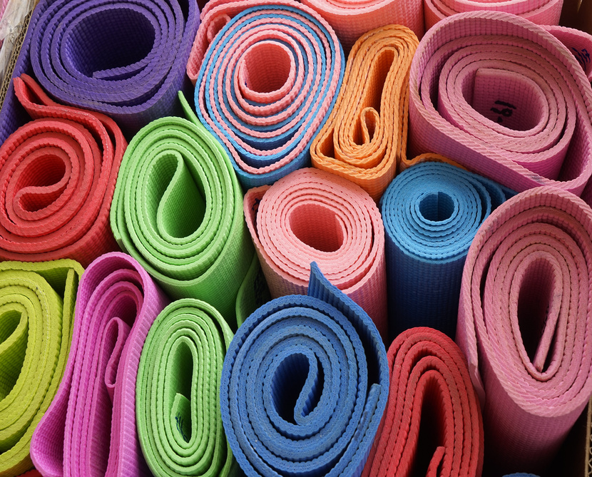
Colour psychology plays a significant role in yoga practice by influencing your mental state and energy levels. Different colours trigger specific emotional and physiological responses that can either enhance or distract from your intended practice experience.
The effects of colour on your yoga practice include:
- Warm colours (red, orange, yellow): Stimulate the nervous system, increasing alertness and energy — helpful for dynamic, heat-building practices
- Cool colours (blue, green, purple): Activate the parasympathetic nervous system, promoting relaxation, deeper breathing, and enhanced concentration
- Neutral colours (beige, grey, brown): Provide grounding without strong psychological triggers, allowing complete focus on movement and breath
- Lighting conditions: The light in your practice space affects how colours appear — and by extension, how they influence your mood and energy
These responses work on both conscious and subconscious levels. Red slightly increases heart rate and blood pressure, making it well-suited to vigorous styles where you want to build heat and intensity. Blue supports mental clarity and concentration. Green connects you to feelings of nature and balance. Understanding these distinctions lets you choose a colour that complements — rather than competes with — your practice intentions.
What does each yoga mat colour mean for your practice?
While broad colour categories offer a useful starting point, individual colours each carry their own distinct psychological profile. Knowing what a specific colour evokes — emotionally, energetically, and physiologically — allows you to make a truly intentional choice rather than simply picking your favourite shade. Below are profiles for the most common yoga mat colours and what each brings to your practice.
Red
Red is one of the most physiologically active colours, known to slightly elevate heart rate and blood pressure and increase feelings of power and urgency. It stimulates the adrenal system, making it well-suited to high-energy practices like power yoga, vinyasa flow, and Ashtanga. Red is also associated with the Root chakra, grounding you in physical presence and vitality. Practitioners drawn to red tend to be motivated by challenge and physical achievement, and benefit most from its energy during morning or midday sessions.
Orange
Orange blends the physical stimulation of red with the optimism of yellow, producing a colour associated with creativity, enthusiasm, and social warmth. It supports the Sacral chakra, which governs emotion, pleasure, and creative expression — making an orange yoga mat a natural fit for flow-based or dance-inspired practices. Orange is energising without being as intense as red, making it a good choice for practitioners who want motivation without overstimulation. It suits those who approach their practice with playfulness and an open heart.

Yellow
Yellow is the colour of mental clarity, optimism, and intellectual energy. It activates the Solar Plexus chakra, associated with personal power, confidence, and self-discipline — qualities that support a consistent and focused practice. Pale or golden yellows work particularly well for morning sessions, where their brightness mirrors natural light and gently energises the mind. Very vivid or neon yellows can become visually tiring over longer sessions, so softer shades tend to be the more sustainable choice.
Green
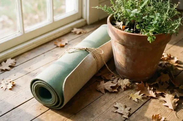
Green is the colour of balance, restoration, and connection to the natural world. It sits at the midpoint of the visible spectrum, making it one of the least visually fatiguing colours — which is why time in nature feels so restorative. Green yoga mat benefits are particularly strong for restorative yoga, yin, and heart-opening practices, as it aligns with the Heart chakra and supports emotional healing and compassion. Practitioners drawn to green tend to value harmony and are often working through stress or seeking greater balance in their lives.
Blue
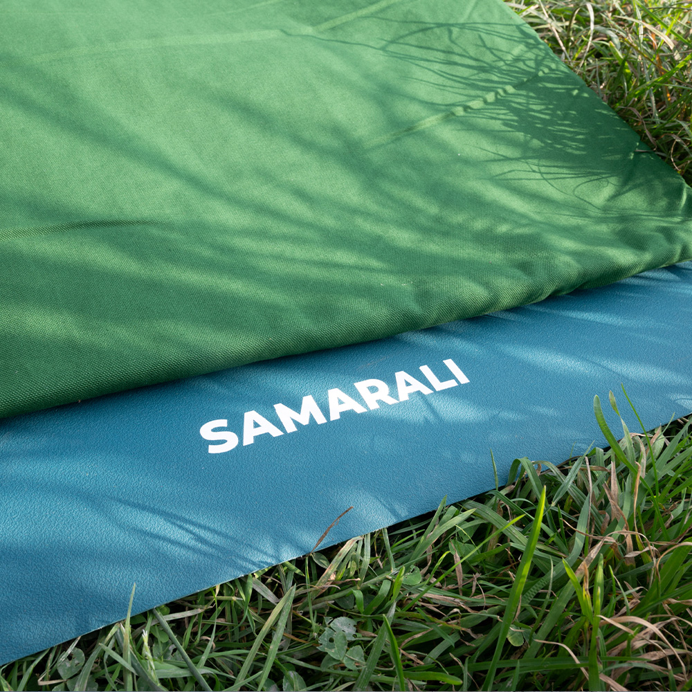
Blue is widely recognised as the most calming colour in the spectrum, known to lower heart rate, reduce cortisol, and encourage deeper, slower breathing. It aligns with the Throat chakra, supporting authentic expression and clear communication — qualities that deepen pranayama and mantra practice. A blue yoga mat is an excellent choice for meditation, restorative yoga, and any practice where mental stillness is the primary goal. Practitioners who tend toward anxiety or overstimulation often find blue mats create a noticeably more peaceful practice environment.
Purple
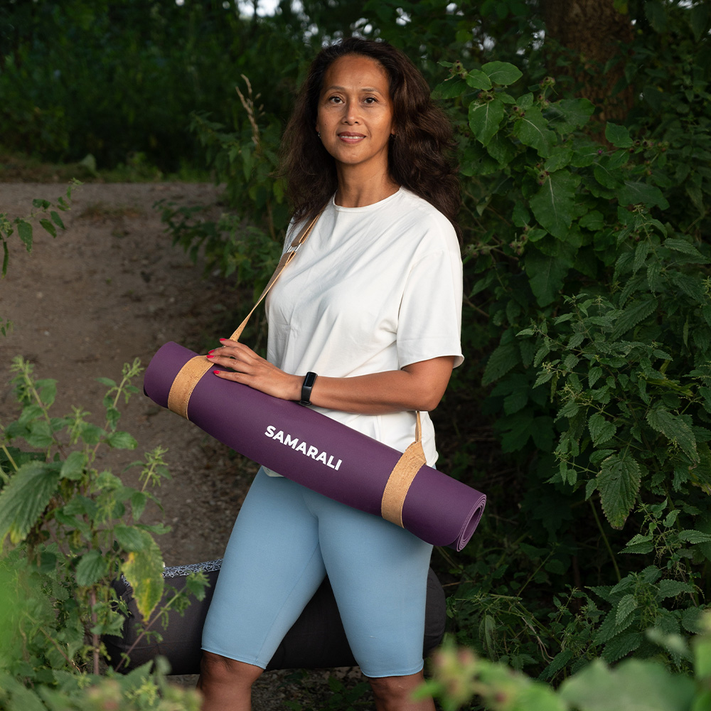
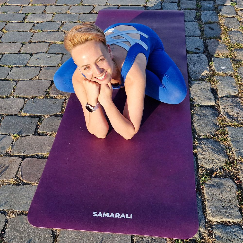
Purple combines the calm of blue with the energy of red, producing a colour associated with intuition, spiritual depth, and inner wisdom. It resonates with both the Third Eye and Crown chakras, making a purple yoga mat an especially intentional choice for practitioners focused on spiritual growth or developing mindfulness. Purple suits evening practices and slower, more introspective styles like yin or yoga nidra. Those drawn to purple often approach yoga as a deeply philosophical or transformative practice rather than primarily a physical one.
Pink
Pink — particularly soft, dusty, or rose tones — evokes compassion, gentleness, and emotional openness. It shares the Heart chakra resonance of green but brings a softer, more nurturing quality. Pink mats suit practices centred on self-care, emotional release, or gentle movement, and are a popular choice for prenatal yoga and restorative sessions. Practitioners drawn to pink often prioritise the relational and emotional dimensions of yoga and benefit from a colour that reinforces kindness toward themselves during practice.
White
White is associated with purity, clarity, and spaciousness — qualities that support a clean mental slate and a sense of fresh beginning. It reflects light rather than absorbing it, which can make a practice space feel more open and airy. White mats suit minimalist practitioners and those who prefer their mat to recede visually so that full attention remains on the body and breath. One practical consideration: white shows oils, sweat, and dirt more readily than darker colours and requires more consistent cleaning to maintain its appearance.
Neutral and earth tones
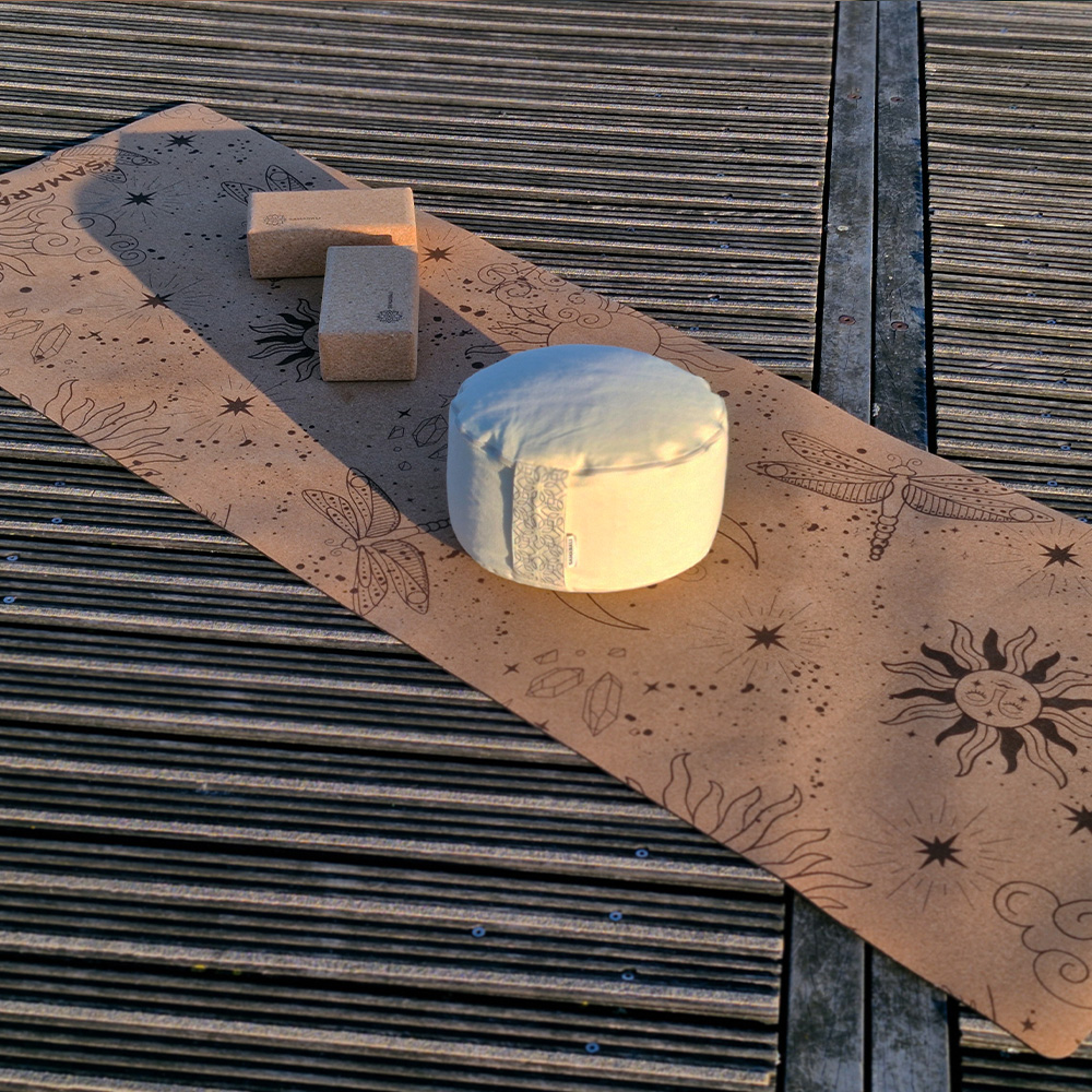
Colours like warm beige, mushroom grey, terracotta, and soft brown offer grounding energy without the psychological charge of brighter hues. They connect the practitioner to natural elements — earth, stone, and wood — and tend to age gracefully, maintaining their aesthetic appeal over years of use. Earth tones are among the most versatile mat colours, supporting everything from vigorous flow to deep meditation without conflicting with the practice’s energy. They are a particularly strong choice for practitioners who want their mat to feel timeless rather than trend-driven.
Choosing your yoga mat colour by chakra alignment
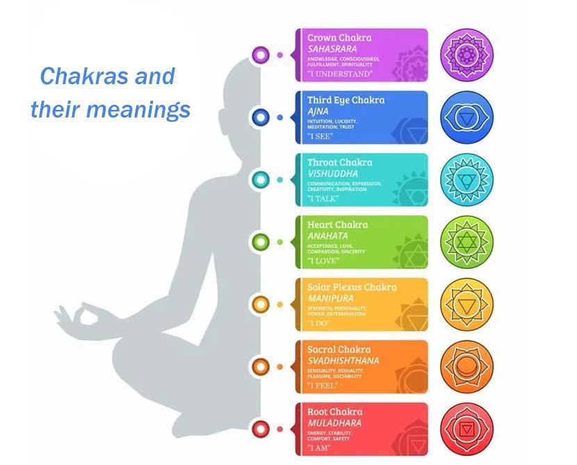
In yogic philosophy, the chakras are seven energy centres located along the spine, each governing specific physical, emotional, and spiritual functions. Ancient traditions have long associated each chakra with a corresponding colour. Choosing a mat colour that aligns with a chakra you are actively working to balance can deepen the intentionality of your practice — creating a subtle but consistent cue that orients your energy every time you step onto the mat.
Below is a breakdown of each chakra, its governing life area, and the mat colour that supports its activation:
- Root chakra (Muladhara) — Red: Located at the base of the spine, Muladhara governs stability, safety, and physical groundedness. A red mat supports practices focused on building strength and presence in the body.
- Sacral chakra (Svadhisthana) — Orange: Located in the lower abdomen, Svadhisthana governs creativity, pleasure, and emotional flow. An orange mat suits fluid, expressive movement practices.
- Solar Plexus chakra (Manipura) — Yellow: Located in the upper abdomen, Manipura governs personal power, confidence, and self-discipline. A yellow mat supports practices aimed at building inner strength and consistency.
- Heart chakra (Anahata) — Green or Pink: Located at the centre of the chest, Anahata governs love, compassion, and emotional balance. Green and pink mats both support heart-opening practices and emotional healing work.
- Throat chakra (Vishuddha) — Blue: Located at the throat, Vishuddha governs authentic expression and communication. A blue mat supports pranayama, mantra, and practices centred on finding your voice.
- Third Eye chakra (Ajna) — Indigo: Located between the eyebrows, Ajna governs intuition, perception, and inner vision. A deep blue or indigo mat suits meditation and introspective practices.
- Crown chakra (Sahasrara) — Violet or White: Located at the top of the head, Sahasrara governs spiritual connection and higher consciousness. A violet or white mat supports practices oriented toward transcendence and deep stillness.
You don’t need to choose a mat colour solely based on chakra philosophy. But if you are working through a specific life area or energetic imbalance, allowing that intention to inform your colour choice adds a meaningful layer of purpose to your practice environment.
What are the best yoga mat colours for different types of practice?
Different yoga styles benefit from specific colour choices that complement their energy and intentions. Matching your mat colour to your practice type creates a more harmonious and supportive environment for your goals.
Optimal colour choices by practice style:
- Restorative and yin yoga: Soft blues, gentle greens, or warm earth tones like beige promote the deep relaxation and introspection these practices require
- Vinyasa and power yoga: Energising colours such as coral, warm orange, or deep red support heat-building and energetic flow without becoming distracting
- Hot yoga and Bikram: Lighter colours like pale blue, soft green, or neutral tones create a cooling visual effect that psychologically counterbalances intense heat
- Meditation practices: Deep purples, soft blues, or neutral greys support inward focus and mental stillness without visual distraction
- Time of day: Morning practices benefit from gently energizing colours like soft yellow; evening sessions work better with calming blues or earth tones
The key is ensuring your chosen colour enhances rather than conflicts with your practice energy. Bright, stimulating colours can be counterproductive during restorative sessions, while overly muted tones might not provide enough energetic support for dynamic practices. It’s also worth considering how a colour will look after extended use — some brighter shades show wear more obviously, which can affect long-term satisfaction with your choice.
How mat colour supports drishti and alignment focus during practice
In yoga, drishti refers to the focused gaze used to support concentration and balance during poses. It is a foundational technique in styles like Ashtanga and vinyasa, where a fixed visual point helps stabilise the body during challenging balancing sequences. What many practitioners don’t consider is that their mat colour directly affects how well drishti functions.
A calm, solid-coloured mat in a mid-tone — such as soft grey, sage green, or slate blue — gives the eyes a stable, neutral resting point that supports visual anchoring without pulling attention away from the body. In contrast, very bright or highly saturated colours can introduce visual noise that makes it harder to settle the gaze during balance poses. Heavily patterned mats present a similar challenge, as the eyes tend to track pattern rather than rest. If you prioritise alignment work, inversions, or balance-intensive sequences, a solid mid-tone mat is one of the most practical choices you can make — and one reason the best yoga mat colour for focus tends to be understated rather than bold.
Which yoga mat colours help create the most calming practice environment?
Calming yoga mat colours include soft blues, sage green, warm beige, and gentle grey tones. These colours naturally lower stress hormones and promote deeper breathing, creating an environment that supports relaxation and mindful movement.
The most effective calming colours and their benefits:
- Soft blue: Reduces mental chatter and slows racing thoughts, making it excellent for both active practice and meditation while supporting Throat chakra work
- Earth tones (beige, soft brown, mushroom grey): Provide grounding energy that helps you feel stable and centred, connecting you to natural elements
- Sage green: Combines the calming properties of blue with gentle energy, supporting Heart chakra work and emotional balance during movement
- Lighting: Choose colours that maintain their calming effect across different lighting conditions throughout your practice times
- Visual harmony: Avoid bright neons, harsh contrasts, or colours that clash with your practice space — these can increase cortisol levels and undermine the relaxation response
These colours work by reducing visual stimulation, allowing your nervous system to more easily access the relaxation response that yoga promotes. The effect is often immediate — many practitioners notice deeper breathing and reduced tension simply from looking at a calming colour. Testing your chosen colour in both bright morning light and softer evening illumination helps ensure it maintains its effect across different practice times.
How do you choose a yoga mat colour that matches your personality and goals?
Choose a yoga mat colour by considering your practice intentions, personal colour preferences, and the environment where you will practise most often. Your mat colour should feel authentic to you while supporting rather than hindering your yoga goals.
Key factors to consider when choosing your mat colour:
- Practice intentions: Identify whether you’re working on building confidence (warmer colours like deep orange) or managing stress (cooler colours like soft blue or lavender)
- Personal style: Consider your natural preferences in clothing and home décor — the colour should feel like an authentic extension of you, not just a functional choice
- Practice environment: Busy studios benefit from neutral colours that create personal space; minimal home spaces might welcome added visual interest
- Longevity: Natural, earth-toned colours from sustainable materials tend to age beautifully and maintain their calming properties over time
- Physical response: Spend time with colour samples in your practice space and notice which colours help you breathe more deeply and feel more centred
Your colour choice should create an immediate sense of rightness when you see it in your practice space — this intuitive response often signals a good match between the colour’s psychological effects and your personal needs. Remember that your preferences may evolve with your practice, so choosing a versatile colour that can grow with your journey often provides the best long-term satisfaction.
Frequently asked questions about yoga mat colours
Does yoga mat colour affect your workout performance?
Colour alone won’t transform your physical performance, but it does influence the mental conditions that support it. Warm colours like red and orange increase alertness and perceived energy, which can translate to greater motivation during vigorous practices. Cool colours like blue and green support focus and calm, which benefits precision-based or meditative sessions. Choosing a colour aligned with your practice type creates a more psychologically supportive environment — which, over time, can meaningfully improve consistency and enjoyment.
What is the best yoga mat colour for hiding sweat and dirt?
Darker colours — charcoal, navy, deep forest green, and black — are the most practical choices for concealing sweat marks, skin oils, and general wear between cleans. Mid-tone earth colours like terracotta and warm grey also perform well. Light colours such as white, pale yellow, and soft blush show oils and residue more readily and require more frequent cleaning to maintain their appearance. If low-maintenance upkeep matters to you, a darker or mid-tone mat is the more forgiving choice.
Do light-coloured yoga mats fade or stain over time?
Vivid and light colours can show the effects of UV exposure, sweat, and repeated cleaning over time — particularly on lower-quality mats with surface-level dyes. Mats made from natural rubber with quality, integrated dyes retain their colour significantly better than synthetic alternatives with printed finishes. Earth tones and mid-range colours generally age more gracefully than bright or pale shades. This is one reason our natural rubber mats are offered in a palette of considered, enduring colours — designed to look as good after years of practice as they do on day one.
Can yoga mat colour help with focus and balance poses?
Yes — and the mechanism is rooted in the yogic concept of drishti, the focused gaze used to stabilise balance during poses. A solid, mid-tone mat colour in sage green, soft grey, or slate blue provides a calm, neutral visual anchor for the eyes, which supports steadiness in standing balances and inversions. Very bright, saturated, or heavily patterned mats can introduce visual distractions that subtly undermine this anchoring. For practitioners who prioritise balance and alignment work, a solid mid-tone colour is one of the most practical choices available.
What yoga mat colour is best for beginners?
For beginners, versatile mid-tone colours — sage green, soft grey, warm beige, or dusty blue — tend to work best. These colours are calming enough to support the focus and patience that learning yoga requires, without being so neutral that they feel uninspiring. They also suit a wide range of practice styles, which is useful when you’re still exploring what type of yoga resonates most. As your practice deepens and your intentions become clearer, you can always move toward a colour that more specifically reflects your evolving goals.
Your yoga mat colour choice reflects your practice journey and personal growth. Whether you choose energising brights or calming neutrals, the right colour supports your intentions and deepens your connection to the practice. At Samarali, we create natural rubber yoga mats, organic cotton mats and cork yoga mats which are thoughtfully selected colours that support both your practice and your environmental values.
Browse our selection of thoughtfully crafted sustainable yoga essentials — designed for mindful movement and made with respect for the planet.